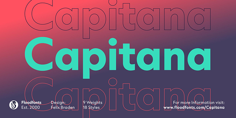
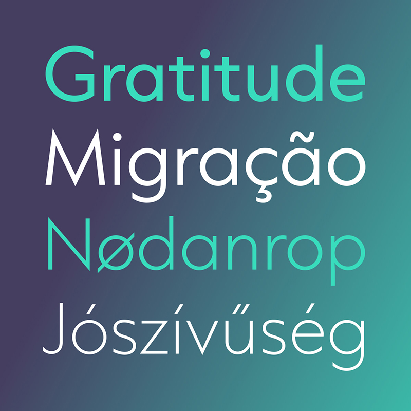
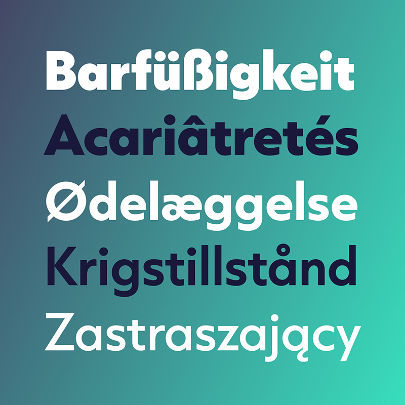
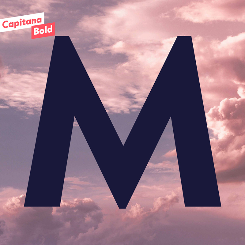
Capitana is a Geometric Sans with humanistic proportions and open apertures. This means that all shapes are constructed from basic forms, the circle, triangle, and square, and are designed according to the classic proportions of the Roman Antiqua. Distinct ascenders and pointed apexes with deep overshoot give it a cool beauty and classic elegance.
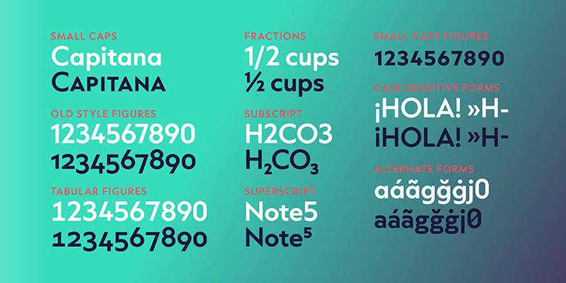
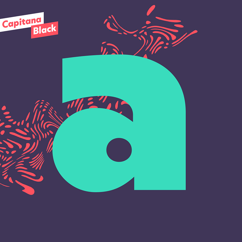
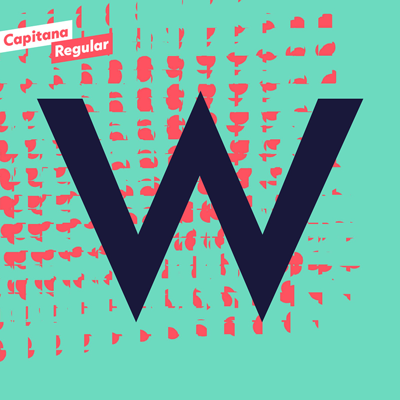
Capitana is an ultimate allrounder: with 784 characters per style in nine weights from Thin to Black, it offers both light and extremely heavy weights for striking headlines. Its open forms make it particularly legible in small sizes, and it also offers several styles for running text. Capitana has a powerful OpenType engine with small caps plus corresponding figures, tabular and old-style figures, arrows, alternate letters for g and a, as well as fractions, superscripts, and subscripts, However, with its minimalist design and low contrast, it is best suited for on-screen use – meaning web design, user interface design (UI&UX), and app design.
Capitana is newly available in the Adobe Creative Cloud.


Design Process
 Capitan was designed by Felix Braden. Working on Capitana started with the idea of adding a heavy master to his Capri family dating back to 2008 and expanding the whole family. After the first drafts, Felix realized that many of the shapes were too eccentric and that he would actually prefer to create a more versatile geometric sans serif. Capri was designed more as a display typeface, so he had to remove so many details and features for that purpose that it wasn’t actually the same typeface anymore.
When Felix decided to stop working on Capri and release it under a different name, he started looking for a way to make it more unique. He remembered the corporate design of the Roman Germanic Museum, which he had the pleasure to design a few years ago. They were looking for a geometric sans serif to perfectly match a humanistic Antiqua. After a rather extensive search, they were finally led to Futura, which he really doesn’t think is contemporary anymore. It has so many oddities, such as the different endings at C, S, and G, that Felix Braden doesn’t consider it a consistent typeface. Despite the many high-quality sans serifs that have been published in recent years, he could not find one that fit better to the humanistic proportions of the Antiqua. Therefore, he decided to close this gap.
For this purpose, the proportions of Capri had to be changed completely. The extremely short ascenders and descenders were significantly extended and the uniform letter width was adapted to the Roman construction principle. While the wide letters such as O, G, and M are drawn on a quadratic base, the narrow letters such as S, E, and B take up only half the space. In this way, the S can be constructed from two circles arranged one above the other, while the O describes a circular arc over the entire cap-height.
For more information please click here https://www.floodfonts.com/capitana
Hard Facts
Foundry: Floodfonts
Designer: Felix Braden
Release: September 27th 2021
Format: OTF, WOFF
Styles: 18, Thin to Black (incl. Italics)
Buy: https://www.myfonts.com/fonts/floodfonts/capitana