Beauty and aesthetics have been praised from time immemorial. But little did people know that the most effective, perfectly balanced, and visually compelling creations followed the tid-bits of mathematics. At least not until 1860, when German physicist and psychologist Gustav Theodor Fechner proposed that a simple ratio, an irrational number defines the balance in nature. The Golden Ratio! Fechner’s experiment was simple: ten rectangles varying in their length-to-width ratios were placed in front of a subject, who was asked to select the most pleasing one. The results showed that the most favored choice was the “Golden Rectangle” (with ratio 1.618).
Golden Ratio
 Golden Mean, Golden Section, Divine Proportion are all common names for what is known as the Golden Ratio which is based off the number phi (φ) = 1.61803398874… discovered by Italian Mathematician Fibonacci. Phi (φ) is the ratio between the number sequence 1, 1, 2, 3, 5, 8, 13, 21 etc. where the next number in the sequence is derived by adding 2 numbers together. So, 1+1 = 2, and 1+2 = 3, 2+3 = 5 and so on.
When we divide two sequential numbers i.e. 5/3 = 1.67 and 21/13 = 1.615 the ratio between these numbers soon become very close to φ (1.618). Fibonacci’s 1202 book Liber Abaci introduced the sequence to Western European mathematics, although the sequence had been described earlier in Indian mathematics, by Brahmaguptain 598 almost a thousand years earlier.
What’s so amazing about this number? Some believe that it is the most efficient outcome, the result of natural forces. Some believe it is a universal constant of design, the signature of God. Whatever you believe, the pervasive appearance of φ in all we see and experience creates a sense of balance, harmony and beauty in the design of all we find in nature. It should be no surprise then that mankind would use this same proportion found in nature to achieve balance, harmony and beauty in its own creations of art, architecture, colors, design, composition, space and even music. From the Parthenon to Monalisa, from the Egyptian pyramids to credit cards, φ has been there, always.
Logos with golden ratio
So, it was not surprising when I found the invasion of φ in logo designs. Let us have a look at some of the most popular brands which have used the golden ratio to induce the perfect harmony and balance in their logos.
National Geographic
Remember the yellow square in the National Geographic logo? Have you ever wondered why that simple logo appears to be so appealing? The answer is, as you might know, the Golden Ratio! The length and width of the square have a ratio of 1.61. It is quite fitting for an organization with a motto of “inspiring people to care about the planet” to have a logo based on the golden rectangle.
Pepsi
The new logo of Pepsi has been much simpler and effective, characterized by spare, pure design. It looks intriguing and beautiful. Almost like a laughing emoticon in red and blue. But did you know that the underlying backbone of the Pepsi logo follows the golden ratio? The Pepsi brand is created by intersecting circles with a set proportion to each other. And, the proportion: Golden Ratio (φ) !
Apple
Apple is one of those very few companies that do not have the company name in their logo. Yet, the Apple logo is one of the most recognized corporate symbols in the world. The logo is perfectly balanced, and the outlines that map the logo are circles with diameters proportionate to the Fibonacci series. Did Rob Janoff really considered the Fibonacci series while designing it, or is it a coincidence? Well, somebody needs to ask Mr. Janoff. Interestingly, in a different context, in an interview, Rob Janoff said, “… and years later you find out supposedly why you did certain things. And, they are all BS. It’s a wonderful urban legend.”
Grupo Boticário
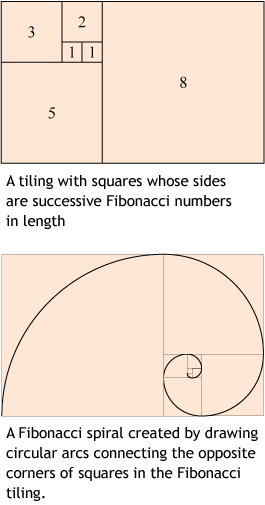
The logo of the Brazilian company Grupo Boticário was designed by the Brazil office of Futurebrand. This logo uses a golden spiral. In geometry, a golden spiral is a logarithmic spiral whose growth factor is φ, the golden ratio. That is, a golden spiral gets wider (or further from its origin) by a factor of φ for every quarter turn it makes. The golden spiral is very closely approximated by the Fibonacci spiral (shown above). The golden spiral is very common in nature, for example, the spiral galaxies and mollusc shells. Do you like the use of golden spiral in this logo?
Repost from banskt.com. Click to view the whole article with more logos in golden ratio.


Nice article!!!